Private Pilot · Unit 6 · 30 min
Reading the Sectional Chart
By the end of this lesson you will know:
- what a sectional chart shows, at what scale it is drawn, and how often a new edition takes effect
- what the color, shape, tick marks, and star of an airport symbol each tell you about the airport
- how to read every field of an airport data block, including the part-time tower star, the circled C, and the RP notation
- what the maximum elevation figure in a quadrangle covers, and the arithmetic that produces it
- which of an obstruction's two printed figures is measured from sea level and which from the ground
- where the airport diagram and its hot spot circles are published, and what one hot spot circle marks
What a sectional chart is
A sectional aeronautical chart, called a sectional, is the chart you plan and fly a VFR cross-country on. It is drawn at a scale of 1:500,000, at which one inch on the sheet is 6.86 nautical miles. The AIM describes the series as designed for visual navigation of slow to medium speed aircraft (AIM 9-1-5). Each sectional is named after a major city within the area it covers (FAA Aeronautical Chart Users' Guide).
Three kinds of information share the one sheet. The topographic information consists of contour lines, shaded relief, drainage patterns, and an extensive selection of visual checkpoints and landmarks used for flight under VFR. The cultural features include cities and towns, roads, railroads, and other distinct landmarks. The aeronautical information includes visual and radio aids to navigation, airports, controlled airspace, special use airspace, obstructions, and related data (AIM 9-1-5). The legend panel printed on the sheet decodes nearly all of it, and it also carries air traffic control frequencies and information on airspace (PHAK Chapter 16).
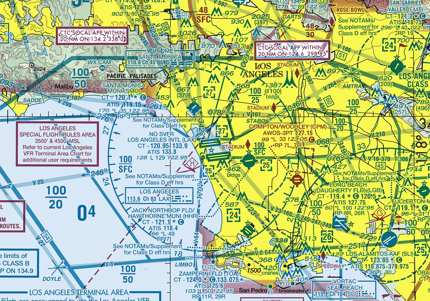
A new edition of each sectional takes effect every 56 days (AIM 9-1-5). The effective dates are printed on the chart itself, and the next scheduled edition date is printed on the cover. The changeover time is 0901Z, chosen because air traffic volume is historically lower then, so that every pilot and controller is working from the same edition at the same moment. Aeronautical information changes faster than the cycle does, so the Users' Guide directs pilots to always use current editions, to discard obsolete charts and publications, and to check NOTAMs for the changes that fall between cycles. 14 CFR 91.103 requires each pilot in command, before beginning a flight, to become familiar with all available information concerning that flight.
The same symbols appear at twice the size on a VFR terminal area chart (TAC), which is drawn at 1:250,000, or one inch to 3.43 nautical miles. A TAC depicts the airspace designated as Class B airspace, and it should be used by pilots intending to operate to or from airfields within or near Class B or Class C airspace (AIM 9-1-5). Where a TAC exists, its coverage is outlined on the sectional by a masked line with a note beside it.
AIM 9-1-5; FAA Aeronautical Chart Users' Guide, "Explanation of VFR Terms and Symbols," "Keep Your Charts Current," and "Terminal Area Chart (TAC) Coverage"; PHAK Ch 16, "Aeronautical Charts"; 14 CFR 91.103
The airport symbol
The way an airport is printed on a sectional chart conveys four independent pieces of information.
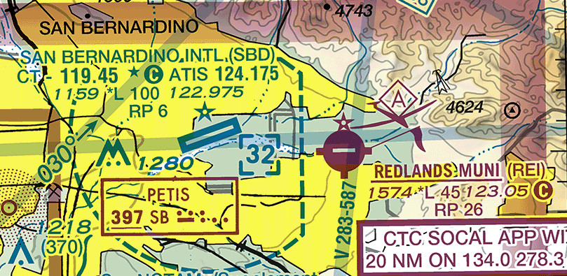
Tower status: The color in which the airport is charted indicates whether it has a control tower. Airports with control towers, and all of their related data, are shown in blue. All other airports and their related data are shown in magenta.
Runway types: Public-use landplane airports are drawn in one of three ways, and the surface and the length of the runways determine which of the three the chart uses. Where the hard-surfaced runways are greater than 8,069 feet, and at some airports with multiple runways shorter than that, the runway pattern itself is drawn in place of a circle. That is why San Bernardino above appears as a long diagonal strip. Where the hard-surfaced runways are 1,500 to 8,069 feet, the airport is drawn as a filled circle carrying a short runway line. Where the runways are other than hard-surfaced, the airport is drawn as an open circle. A seaplane base is drawn as an anchor.
Fuel availability: Tick marks around the basic airport symbol indicate that fuel is available at the airport, and the Users' Guide sends you to the Chart Supplement for the details and the availability. The chart does not tell you which grades, or when the pumps are open.
Airport beacon: A five-pointed star beside the symbol indicates the existence of a rotating or flashing airport beacon operating from dusk to dawn. The lighting lesson covered what that beacon looks like from the air and what its color pairs mean.
FAA Aeronautical Chart Users' Guide, "VFR Terms and Symbols: Airports"
The airport data block
Beside each airport symbol sits an airport data block, a compressed stack of two to four lines. The legend defines every character in it, and the order of the fields is fixed.
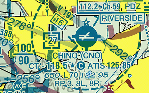
Reading Chino line by line gives every field you will meet:
- CHINO (CNO). Airports are identified by their official FAA designated name, followed by the location identifier in parentheses. Where an ICAO location identifier also applies, it prints in a second pair of parentheses.
- CT - 118.5. CT introduces the control tower's primary frequency. This field appears only in blue, because only a towered airport has one.
- The star after 118.5. A star in this position indicates that the tower operates part-time. The hours are in the tower frequencies tabulation printed on the chart. Chino's tower runs 1500 to 0500Z, so for part of every day this is a nontowered airport.
- The circled C. The circled C follows the common traffic advisory frequency (CTAF), which is the frequency designated for airport advisory practices while operating to or from an airport without an operating control tower. It sits immediately after 118.5 here, so Chino's CTAF is the tower frequency. On the Redlands block in the previous section the circled C sits after 123.05 instead, because there the CTAF is the aeronautical advisory station frequency. The radio lesson covered what you say on it.
- ATIS 125.85. The automatic terminal information service frequency. Where an airport has no full-time ATIS, an ASOS or AWOS frequency prints in this position instead, as the same lesson described.
- 650. The elevation in feet above mean sea level, which is the highest point on the usable portion of the landing areas.
- L. The lighting code. A plain L means runway lights are on from dusk to dawn. An asterisk in front of it, printed as *L, means lighting limitations exist and you must consult the Chart Supplement to find them: lighting available on request, part-time lighting, or pilot-controlled lighting. Both airports in the previous section print *L. Lighting codes refer to runway edge lights. The lighted runway may not be the longest runway available, and the lights may not run its full length. A dash in this position means no runway edge lights.
- 70. The length of the longest runway in hundreds of feet, so 7,000 feet at Chino. The figure is the longest active runway, including displaced thresholds and excluding overruns, and the usable length may be less than it. It is rounded to the nearest 100 feet using 70 as the rounding point, so a runway 8,070 feet long is charted as 81 while one 8,069 feet long is charted as 80.
- 122.95. The aeronautical advisory station, which is the UNICOM frequency.
- RP 3, 8L, 8R. Right traffic patterns are indicated at public-use and joint-use airports with the abbreviation RP for right pattern, followed by the appropriate runway numbers, at the bottom of the airport data block (AIM 4-3-3). Chino flies a right-hand pattern on runways 3, 8L, and 8R. An asterisk in front, printed as *RP, indicates special conditions or restrictions and sends you to the Chart Supplement. Right traffic patterns are not shown at airports with full-time control towers (AIM 4-3-3). Chino's tower is part-time, which is why its block carries the line. Do not read a missing RP line at a full-time towered field as a promise of left traffic. The traffic pattern lesson covered what the direction of turns requires of you.
Where information is lacking for a field, the respective character is replaced by a dash. Two more marks attach to the airport name rather than to the block. NO SVFR printed above the name marks an airport where fixed-wing special VFR operations are prohibited. The weather minimums lesson covered the clearance those operations require. An airport name printed inside a solid line box marks a part 93 special air traffic rule and airport traffic pattern, and sends you to the Chart Supplement for the requirements.
FAA Aeronautical Chart Users' Guide, "VFR Terms and Symbols: Airports"; AIM 4-3-3
Terrain and the maximum elevation figure
The FAA uses five techniques together to show the shape and height of the ground: contour lines, shaded relief, color tints, obstruction symbols, and maximum elevation figures.
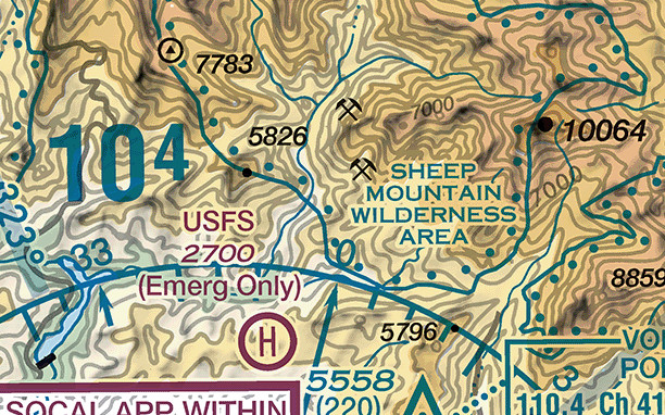
A contour line joins points of equal elevation. On sectionals, basic contours are spaced at 500 foot intervals. Intermediate contours are typically at 250 foot intervals in moderately level or gently rolling areas, and auxiliary contours at 50, 100, 125, or 150 foot intervals occasionally show smaller relief features where the relief is low. Widely spaced contours represent gentle slopes, and closely spaced contours represent steep slopes. Shaded relief is drawn as if the light were coming from the northwest, because human visual perception has been conditioned to that view. Color tints show bands of elevation relative to sea level, ranging from light green for the lower elevations to dark brown for the higher ones. A heavy dot with a number beside it is a spot elevation, giving the elevation of that point in feet above sea level.
The large blue number in each quadrangle is the maximum elevation figure (MEF), and it represents the highest elevation within a quadrant, including terrain and other vertical obstacles such as towers and trees. A quadrant on sectionals is the area bounded by the ticked lines dividing each 30 minutes of latitude and each 30 minutes of longitude. MEF figures are rounded up to the nearest 100 foot value, and the last two digits of the number are not shown, which is why the last digit prints smaller and raised. The 104 in the figure above is 10,400 feet above sea level.
The figure is not simply the highest elevation rounded up. Where a natural terrain feature is the highest feature in the quadrangle, the FAA determines the elevation of the feature, adds the possible vertical error of the source, adds a 200 foot allowance for uncharted natural or man-made obstacles, and then rounds up to the next higher hundred-foot level. The source error added is 100 feet, or half the contour interval where the interval on the source exceeds 200 feet. The 200 foot allowance exists because chart specifications do not require obstacles below a minimum height to be portrayed at all. Working that through for the figure above: the highest terrain in the quadrangle is 10,064 feet, plus 100 feet of possible vertical error is 10,164, plus the 200 foot obstacle allowance is 10,364, and rounding up to the next hundred gives 10,400. The chart prints 104.
Where instead a man-made obstacle stands more than 200 feet above the highest terrain in the quadrant, the FAA takes the elevation of the top of the obstacle above sea level, adds the same possible vertical error, and rounds up. That procedure adds no 200 foot allowance.
FAA Aeronautical Chart Users' Guide, "Land Features (Terrain) and Obstructions" and "VFR Symbology: Relief"
Obstructions
Sectionals and TACs typically show man-made obstacles extending more than 200 feet above ground level, or more than 299 feet above ground level inside the yellow city tint. Smokestacks, tanks, factories, lookout towers, antennas, and wind turbines are among the features treated as hazardous obstacles to low-level flight.
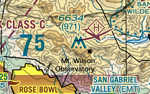
The chart draws an obstruction at one of two symbol heights, and the taller symbol carries a bar near its top. The short symbol marks an obstacle above 200 feet and below 1,000 feet above ground level, or above 299 feet in an urban area. The tall symbol marks an obstacle 1,000 feet above ground level or greater.
Two figures print with the symbol, and the order is fixed. The elevation of the top of the obstacle above mean sea level comes first, and the height of the structure above ground level follows in parentheses below it. Mount Wilson above is therefore a structure 971 feet tall whose top is at 6,634 feet above sea level. Subtracting the height from the elevation puts the ground it stands on at 5,663 feet. In extremely congested areas the FAA typically omits the parenthesized height to avoid confusion. A single unparenthesized figure is the elevation above sea level.
Two variations complete the set. Where obstacles stand close together, only the highest is represented, using the group obstruction symbol drawn as joined peaks. The legend's group forms cover at least two obstructions in the group, and the figures printed with the symbol belong to the highest one. Where a specialist cannot verify an obstacle's position or elevation, the letters UC print next to the symbol, meaning it is under construction or has been reported but not verified.
Obstacles may be lit or unlit. Where an obstruction carries a high-intensity strobe lighting system, the chart draws short rays radiating from the top of the symbol. The legend notes that such lights may operate part-time or by proximity activation. Mount Wilson prints no such rays, so its lighting is not the high-intensity kind. The lighting lesson covered the red obstruction lights that mark most structures at night. Wind turbines have their own symbol. A concentrated wind turbine farm is drawn as a hatched area with a dotted outline, and a boxed figure beside it gives the sea level elevation of its highest turbine. Turbine blades and blade tips are not lighted, and the lights sit on the nacelle, which in some cases is 200 to 300 feet below the rotating blade tips.
FAA Aeronautical Chart Users' Guide, "Land Features (Terrain) and Obstructions" and "VFR Symbology: Navigational and Procedural Information"
Navigation aids and visual checkpoints
The chart prints information about a radio aid to navigation, or NAVAID, inside a box. The type is identified by VOR, VORTAC, VOR-DME, or DME positioned on and breaking the top line of the box, and the box carries the facility name, the frequency, the TACAN channel where there is one, the identifier, and the identifier's Morse code. A NAVAID physically located on an airport may not always appear as the typical NAVAID symbol. Where one is collocated with an airport icon, a small open circle indicates its location.
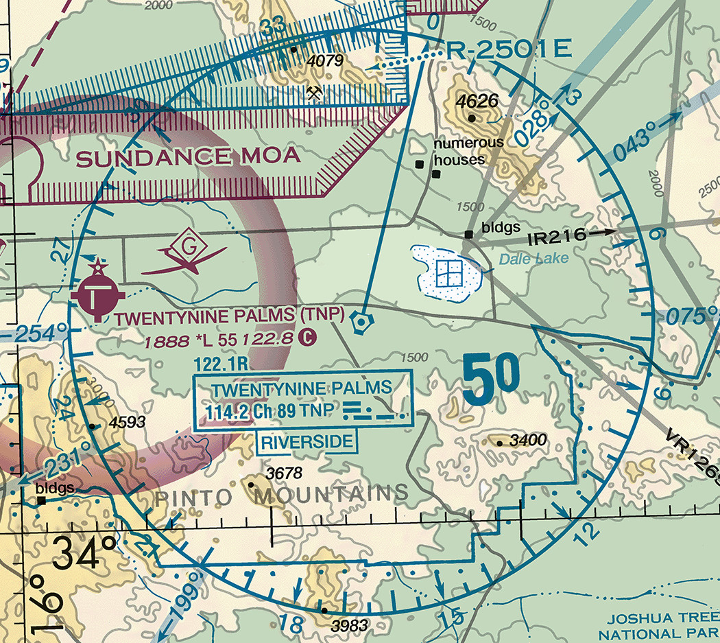
A compass rose is drawn around most VOR facilities. The Users' Guide states that the rose is a reference oriented to magnetic north. The numbers around the rim are therefore magnetic, the same reference your heading indicator and magnetic compass work in. Comparing a number from the rose with a heading on the panel requires no correction for magnetic variation. Each graduation is a radial, a magnetic bearing measured outbound from the station. DMEs are shown without a compass rose. Tuning a receiver to one of these facilities, identifying it, and tracking a radial belongs to VOR and GPS in Unit 10.
A magenta flag marks a VFR checkpoint, one of the visual checkpoints and landmarks the sheet carries for flight under VFR (AIM 9-1-5). Where the flag carries a name, an underline beneath the name indicates the proper name of the checkpoint. For high-traffic mountain passes, VFR checkpoints may be provided to increase situational awareness by marking key landmarks inside confined terrain. Some checkpoints have a VFR waypoint collocated with them, drawn as a four-pointed star with a five-character identifier beginning VP. Using those in a receiver is Unit 10 material as well.
FAA Aeronautical Chart Users' Guide, "Radio Aids to Navigation" and "VFR Symbology: Navigational and Procedural Information"; AIM 9-1-5
From the chart to the Chart Supplement
An airport data block is abbreviated because there is no room beside the symbol for more. The Chart Supplement U.S. carries the rest. It shows the data that cannot be readily depicted in graphic form, for example airport hours of operation, types of fuel available, runway widths, and lighting codes (AIM 9-1-5).
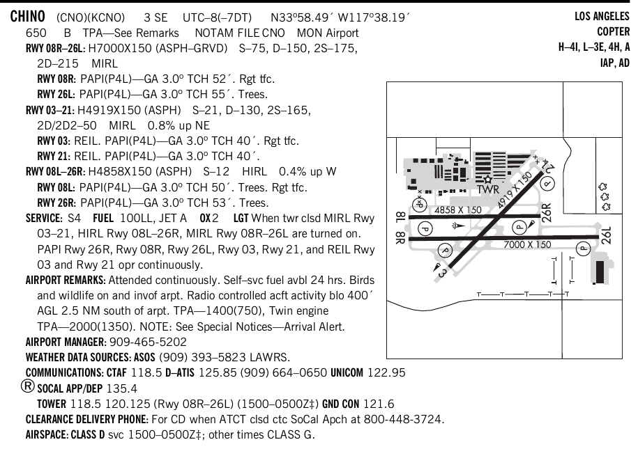
Set the entry against the block. The chart said 70, meaning a longest runway of 7,000 feet. The entry says H7000X150 (ASPH-GRVD), which gives the 150 foot width, the asphalt surface, and the grooving. The same line gives the weight the pavement will bear and marks its edge lights as medium intensity. The chart said 118.5 with a star, which sent you to the tower frequencies tabulation for the hours. The entry prints them directly: TOWER 118.5 120.125 (Rwy 08R-26L) (1500-0500Z‡). The entry annotates the second frequency for runway 08R-26L, and the double dagger marks hours that run one hour earlier during daylight saving time. Below that line, AIRSPACE: CLASS D svc 1500-0500Z‡; other times CLASS G states what the airspace becomes when the tower closes. The chart said RP 3, 8L, 8R. The entry prints Rgt tfc. under each of those three runway ends. Its TPA line sends you to the remarks for the pattern altitude that the traffic pattern lesson covered.
The entry also carries what the chart has no room for at all:
- the approach slope indicator on each runway end and the glide angle it is set to
- the trees off two of those ends
- the fuel grades available and the hours of self-service fuel
- the airport manager's telephone number
- the weather data source and its telephone number
- the remark that radio-controlled aircraft operate below 400 feet above the ground two and a half miles south of the field
Read the entry in full before flying to an airport you have not used before.
AIM 9-1-5; Chart Supplement U.S., Southwest volume, Directory Legend and the Chino entry
The airport diagram and its hot spots
An airport diagram is a plan-view drawing of one airport's runways, taxiways, and ramps, specifically designed to assist in the movement of ground traffic at locations with complex runway and taxiway configurations. It is not intended for use in approach and landing or departure operations. It assists pilots in identifying their location on the airport, which reduces requests for progressive taxi instructions. A progressive taxi is a precise taxi instruction given to a pilot unfamiliar with the airport, or issued in stages as the aircraft proceeds along the taxi route (Pilot/Controller Glossary).
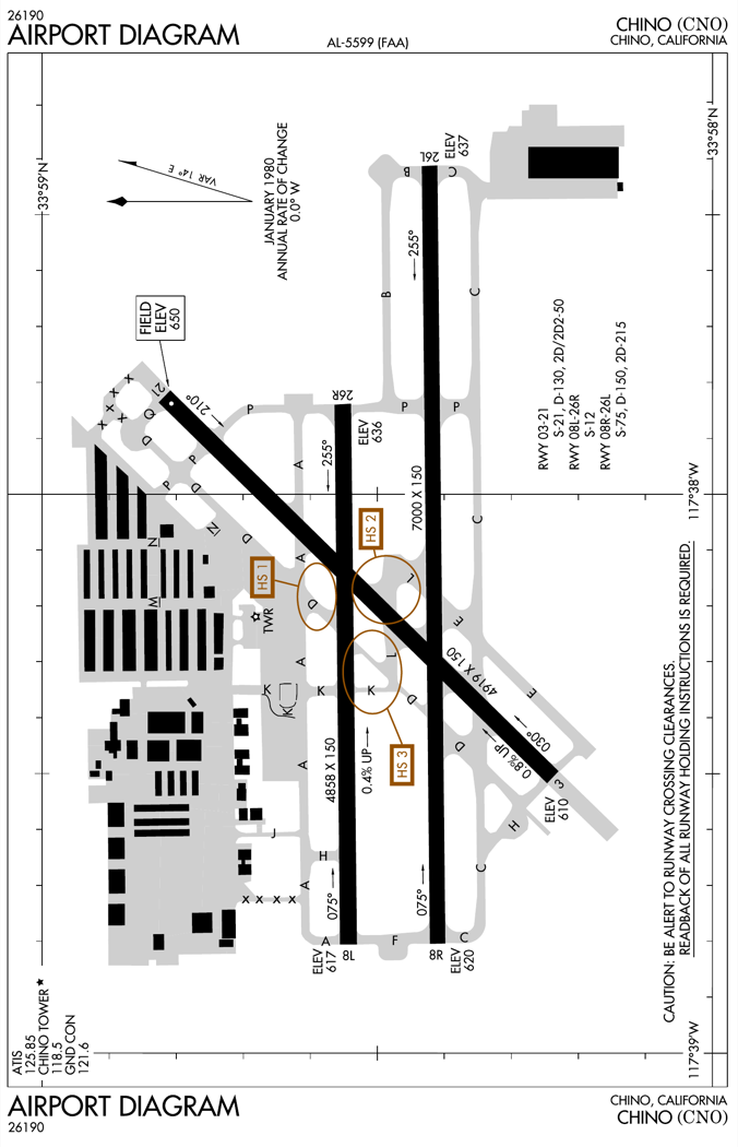
Airport diagrams are one of the five chart types that make up the U.S. Terminal Procedures Publication, alongside instrument approach procedure charts, departure procedures, standard terminal arrival charts, and charted visual flight procedure charts. Selected towered airport diagrams are also published in the airport diagram section of the Chart Supplement, in support of the FAA's Runway Incursion Program. That section's legend states that the diagrams there are the same as those published in the Terminal Procedures Publication. What the Chart Supplement prints inside an individual airport's entry is a smaller drawing than the airport diagram: an airport sketch, of the kind visible at the right of the Chino entry above.
The diagram carries:
- the runways, complete with magnetic headings and identifiers, their dimensions, displaced thresholds, runway end elevations, surface composition, and weight bearing capacity
- land and hold short lines, ILS hold lines, and localizer and glide slope critical areas
- the taxiways with their identifiers
- the parking areas, run-up pads, and non-movement areas
- the control tower, the beacon, the lighting, and the navigation aids
- the communications frequencies, where a star again indicates part-time status
A hot spot is a runway safety related problem area on an airport that presents increased risk during surface operations, typically a complex or confusing taxiway intersection or taxiway and runway intersection, as the markings lesson covered. Hot spots are indicated on the airport diagram with a brown open circle or ellipse leadered to a hot spot number, such as HS 1. Each number corresponds to a listing on the hot spot pages, which give a written description of what goes wrong there. The hot spot pages describe Chino's three:
- pilots taxiing south on Taxiway D sometimes fail to turn onto Taxiway A and proceed onto Runway 08L-26R by mistake
- pilots taxiing west on Taxiway L sometimes turn onto Runway 03-21 by mistake
- after crossing Runway 21 westbound on Taxiway L, pilots sometimes confuse Taxiway D with Taxiway K and cross the 08L-26R holding position marking without authorization
Hot spots remain charted until the increased risk has been reduced or eliminated.
FAA Aeronautical Chart Users' Guide, Terminal Procedures Publication terms, "Airport Diagrams" and "Hot Spots"; Chart Supplement U.S., "Airport Diagrams" and "Airport Hot Spots"
What this unit has covered
This unit has covered:
- the traffic pattern and the way a nontowered field is flown
- the markings painted on the surface and the signs posted beside it
- the lighting and the wake turbulence you keep clear of
- the self-announced calls at a nontowered field
- the clearances and instructions a tower issues
- the chart and the publications that describe an airport before you see it
Unit 7 turns from the airport to the air itself: the structure of the atmosphere, how pressure and temperature produce wind, what makes air stable or unstable, and where clouds, icing, and thunderstorms come from.
You make all four of these readings during planning, while there is still time to look up what a 1:500,000 sheet has no room to carry.
- Read the airport's color before anything else. Blue means a control tower, magenta means none, and that single fact decides which radio procedure you use on arrival.
- Check the RP line every time, and treat its absence as information only at a part-time towered or nontowered field. Right traffic patterns are not shown at airports with full-time control towers.
- Take the maximum elevation figure as the highest elevation in the quadrangle, not as a safe altitude. Where terrain is the highest feature it already includes an allowance for source error and a 200 foot allowance for uncharted obstacles, and no figure is verified by field survey.
- Open the Chart Supplement entry and the airport diagram for any airport you have not been to. The runway widths, the fuel, the tower hours, and the hot spots are not on the sectional at all.
Check your understanding
Answer from memory, without scrolling back up. Recalling it yourself is what makes it stick.
A sectional chart is drawn at what scale, and a new edition takes effect how often?
Sectional charts have a scale of 1:500,000, one inch to 6.86 nautical miles, and are revised every 56 days. The effective dates are printed on the chart, and the changeover time is 0901Z. (AIM 9-1-5)
1:250,000 is the VFR terminal area chart, which shows the airspace designated as Class B airspace at twice the sectional's scale. Both series are revised every 56 days.
An airport whose symbol and printed data are magenta rather than blue?
Airports with control towers and their related data are shown in blue. All other airports and their related data are shown in magenta. (FAA Aeronautical Chart Users' Guide)
The color in which an airport is charted indicates whether it has a control tower and nothing more. The shape of the symbol indicates the runway surface and length, and the L or *L code in the data block indicates the lighting.
Tick marks around an airport symbol, and a star beside it, mean?
Fuel availability is indicated by tick marks around the basic airport symbol, and the star indicates a rotating or flashing airport beacon operating from dusk to dawn. Consult the Chart Supplement for fuel details and availability. (FAA Aeronautical Chart Users' Guide)
Tick marks around the symbol indicate fuel, not lighting. A star beside the symbol indicates a beacon, and the star that marks a part-time tower is printed after the control tower frequency inside the data block.
A data block reads 650, then L, then 70, then 122.95. The 70 is?
That field is the length of the longest runway in hundreds of feet, and the usable length may be less. It is rounded to the nearest 100 feet using 70 as the rounding point. (FAA Aeronautical Chart Users' Guide)
The field elevation is the first number in that line, 650 feet here. The runway figure that follows the lighting code is in hundreds of feet, so 70 is 7,000 feet.
In a data block, the star after the tower frequency and the circled C mark?
The star indicates that the tower operates part-time, with the hours in the tower frequencies tabulation, and the circled C follows the common traffic advisory frequency. (FAA Aeronautical Chart Users' Guide)
The ATIS frequency is labelled ATIS in the same line. The circled C follows whichever frequency serves as the CTAF, which at some airports is the tower frequency and at others the aeronautical advisory station.
The notation RP 26 at the foot of an airport data block means?
Right traffic patterns are indicated at public-use and joint-use airports with the abbreviation RP, followed by the appropriate runway numbers, at the bottom of the airport data block. An asterisk in front, *RP, sends you to the Chart Supplement for special conditions. (AIM 4-3-3)
The pattern altitude is not in the data block at all; it is published in the Chart Supplement. Right traffic patterns are not shown at airports with full-time control towers.
The maximum elevation figure printed in a quadrangle of a sectional gives?
The MEF represents the highest elevation within a quadrant, including terrain and other vertical obstacles such as towers and trees, rounded up to the nearest 100 foot value with the last two digits not shown. (FAA Aeronautical Chart Users' Guide)
The figure includes man-made obstacles, and it is not an altitude to fly. Where terrain is the highest feature it carries an allowance for source error and a 200 foot allowance for uncharted obstacles, and no figure is verified by field survey.
An obstruction prints 6634 with (971) below it. Those two figures are?
The elevation of the top of the obstacle above mean sea level comes first, and the height of the structure above ground level follows in parentheses below it. (FAA Aeronautical Chart Users' Guide)
The larger figure is the sea level elevation of the top. Subtracting the parenthesized height gives the elevation of the ground the structure stands on.
The compass rose printed around a VOR on a sectional is oriented to?
The Users' Guide states that the compass rose is a reference oriented to magnetic north, so each graduation is a radial measured as a magnetic bearing outbound from the station. DMEs are shown without the compass rose. (FAA Aeronautical Chart Users' Guide)
Because the rose is magnetic, its numbers agree with your heading indicator and magnetic compass directly, with no correction for variation between the chart and the panel.
Hot spot circles are drawn on the airport diagram, which is published?
Airport diagrams are one of the chart types making up the U.S. Terminal Procedures Publication, and selected towered airport diagrams are also published in the airport diagram section of the Chart Supplement, where the legend states they are the same diagrams. A hot spot circle marks a complex or confusing intersection with increased risk during surface operations. (FAA Aeronautical Chart Users' Guide; Chart Supplement U.S.)
The sectional carries no taxiway detail at all, and the sketch inside an individual Chart Supplement entry is a smaller drawing than the airport diagram. Hot spot circles are drawn on the diagram and described on the hot spot pages.
Go deeper (primary source): read the FAA Aeronautical Chart Users' Guide, starting with the VFR Terms and Symbols chapter and then the Sectional and Terminal Area Charts symbology pages, and compare each legend swatch against the same symbol on your own local sectional. Then read the Directory Legend at the front of your Chart Supplement volume in full, and the airport diagram legend in the Terminal Procedures Publication.